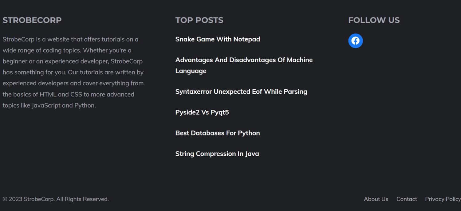
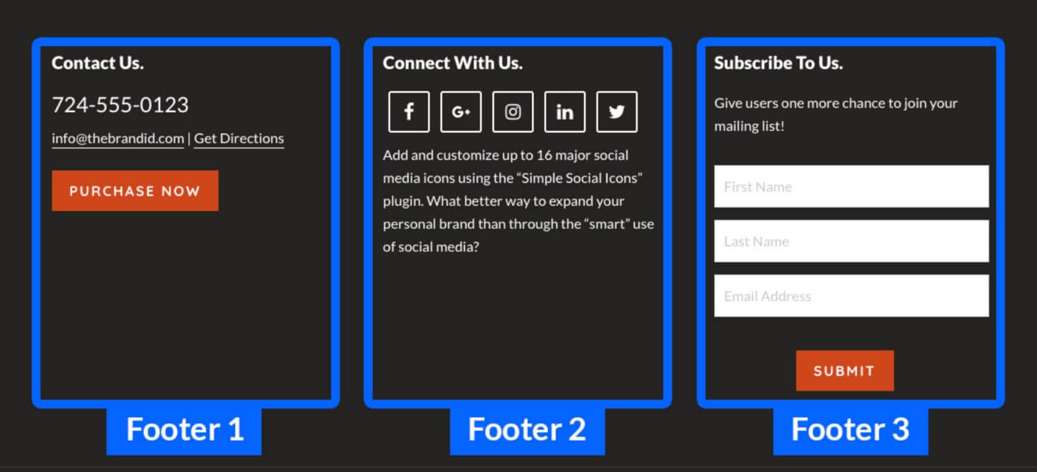
A website’s footer is a crucial component that appears at the bottom of the page. It serves as an information hub containing essential details like copyright notices, contact information, and links to other pages on the site. A well-crafted simple footer HTML enhances the website’s overall usability and contributes to its branding.
Following are some of the best practices, along with code examples that you may use for a responsive and straightforward footer HTML:
- Simplicity is the key
- Link to Essential Information
- Organize Links Logically
- Incorporate Copyright Notice
- Utilize Graphic Elements
- Prioritize Contrast and Readability
Practice and experimentation are key to mastering the creation of boxes in HTML, allowing you to unleash your creativity and design skills. This article will explore some of the best practices for designing a simple and effective footer in HTML, accompanied by code examples for practical implementation.
Check this out: Website Building Basics: How To Make Multiple Pages In HTML
Table of Contents
Best Practices for Designing a Simple Footer HTML
Simplicity is the Key
Maintain a visually consistent footer design in HTML that complements the rest of the website. Avoid overcrowding the footer with unnecessary elements, ensuring it remains clean and uncluttered.
Link to Essential Information
Include links in the footer to vital information about your website, such as contact details, copyright information, and a privacy policy. This facilitates easy access to critical resources for visitors.

Organize Links Logically
Arrange the links in the footer logically to enhance user experience. A well-organized footer allows visitors to find the information they are seeking quickly.
See also: Web Design Basics: Understanding The Interface Of A Website
Incorporate Copyright Notice
Adding a copyright notice in the footer is essential to inform visitors about the ownership of the website’s content and protect your intellectual property rights.

Utilize Graphic Elements
Enhance the visual appeal of the footer by incorporating graphic elements like logos or social media icons. These elements can contribute to the branding and overall aesthetics of the website.
Read also: User-Friendly Navigation: Creating An HTML Sidebar Menu
Prioritize Contrast and Readability
Ensure the footer is easy to read using contrasting colors and legible fonts. An easily readable footer encourages visitors to engage with the content.
Footer Code in HTML and CSS
Example 1:
<footer> <div class="container"> <p>Copyright &copy; 2024 My Website</p> <ul> <li><a href="#">Contact Us</a></li> <li><a href="#">Privacy Policy</a></li> <li><a href="#">Terms of Service</a></li> </ul> </div> </footer>
This code creates a straightforward, simple footer HTML featuring a copyright notice and a list of essential links within a container.
Example 2:
<footer>
<div class="container">
<div class="logo">
<img src="logo.png" alt="My Website Logo">
</div>
<ul>
<li><a href="#">About Us</a></li>
<li><a href="#">Products</a></li>
<li><a href="#">Services</a></li>
<li><a href="#">Contact Us</a></li>
</ul>
<ul class="social">
<li><a href="#">Facebook</a></li>
<li><a href="#">Twitter</a></li>
<li><a href="#">LinkedIn</a></li>
<li><a href="#">Instagram</a></li>
</ul>
</div>
</footer></span>
In this more elaborate code example, you can design a footer with a logo, a list of links, and a separate list of social media icons.
Check this out: Web Design: Understanding HTML Role Presentation
Simple Footer HTML Design Trends
Minimalistic Design
The prevailing trend in footer design involves embracing minimalism. This entails crafting simple and clean footers with a restrained amount of text and graphics. Such footers in CSS appear visually appealing and offer a sense of sophistication and elegance.
Social Media Icons Integration
Integrating social media icons in the footer has gained significant popularity. By doing so, website owners can establish connections with visitors on various social media platforms, fostering engagement and driving traffic to their social media profiles.
![]()
Call to Action Implementation
Leveraging the footer for a call to action has become a widely adopted strategy. Including a clear and compelling call to action, such as a link to a contact form or a signup form, in the footer can entice visitors to take the desired action, leading to increased conversions.
See also: Engage Your Visitors: Creating An HTML Chat Box
Footer Widgets
Footer widgets have emerged as a practical feature in modern footer design. Website owners can use these widgets to showcase additional information, such as the latest blog posts, upcoming events, or a newsletter signup form, enhancing user engagement and providing valuable content to visitors.

Accessible Footer
To ensure an inclusive user experience, your footer must be accessible to all users, including those with impairments. Here are some crucial pointers for creating an accessible footer:
- Use Language That Is Simple and Clear
- Use contrasting fonts and colors
- Add alternative text to images
- Make Sure It Can Be Read on All Devices
By adhering to these accessibility guidelines, you can create a footer that not only fulfills its functional purpose but also accommodates the diverse needs of your website visitors.
See also: Transform Your Website: Change CSS Styles Using JS
FAQs
What is the purpose of a footer in HTML?
The footer serves as an essential component in any website's design. It is usually found at the bottom of the page and provides critical details, including copyright data, contact details, and links to other pages on the website. A well-designed footer contributes to enhancing the website's overall usability and branding.
What are some best practices for creating a simple and responsive HTML footer?
To design a simple footer in HTML, consider the following best practices: 1. Avoid clutter and keep the design straightforward and aligned with the website's leading tone. 2. Include links to important information such as contact details, copyright notices, and privacy policies. 3. Organize the links logically to facilitate easy navigation for visitors. 4. Add a copyright notice to establish ownership of the website's content. 5. Utilize graphic elements like logos or social media icons to add visual appeal. 6. Ensure readability by using contrasting colors and appropriate font styles.
What are some common elements that are included in a footer?
Common elements found in a footer include: Copyright notice, Contact information, Links to important pages on the website, Social media icons, Privacy policy, Terms of service, Disclaimer, and Sitemap.
What are some things to avoid when designing a footer?
When designing a footer, consider avoiding the following: 1. Overcrowding the footer with excessive information, keeping it easy to scan. 2. Using too many colors or fonts may disrupt the website's visual consistency. 3. Opting for a font size that is too small makes it difficult for visitors to read. 4. Placing critical information in the footer, which one should reserve for secondary details. Important information, such as contact details and privacy policy, should be prominently displayed elsewhere on the website.
Conclusion
In conclusion, any website’s footer is crucial to its design and functioning. Following the best practices discussed earlier and employing the provided HTML code examples will enable you to craft an efficient and visually captivating footer for your website.
It is crucial to remember that a well-designed footer not only improves the user experience but also adds to your online platform’s overall professionalism and credibility.
As the final touch at the bottom of the page, the footer can potentially leave a positive impression on your visitors and reinforce your brand identity. Therefore, investing time and effort into creating a thoughtfully designed footer can significantly impact the overall success of your website.

